
Usually, an analyst would dedicate 7 business days to deliver a performance report.
With the New Performance Dashboard, this number droped from 7 to 1 business day.

Check how my team and I came to this result:
The dream team


Product context
Ion is a low-code website builder foccused in CRO interfaces. Customers use it for inbound-marketing campaigns, and they not only build the interfaces using the tool, but also generate leads and manage engagement rates achieved.
The problem
"Part of our customers notion of ROI relyies on monitoring their results for using the product, but our reports are too hard to read!"
Project's goal
→ Reduce the time users (both customers and Rock's analysts) spend crunching down reports
→ Provide new data
→ Fix bugs
Process
1. Research: desk research, interviews with users and Rock's analysts and heuristic evaluation
2. Ideation: flow adjustment, new metrics and panels and bug-fixes
3. Prototyping: wireframes and high fidelity prototyping
4. Validation: usability test and final adjustments
5. Handoff: breaking down in development/launching phases, documentation and metrics of success.

Research
The first time we wondered about the necessity of redesigning Ion's Reports came from a statement given by one of Rock's strategy analysts:
Our customers are comiting the same mistakes on every new campaign and expecting different results. They have no clue of what they are doing wrong so we have to walk them through their own reports.
Long story short, our research process consisted on
1. Heuristic evaluation to point out hypothesis on what were our oportunities of improvement;
2. Interviews with CS Analysts, the ones who present the untangled data to customers;
3. Interviews with customers who were suposed to be using these reports on their own;
4. Interviews with stakeholders, to understand the business impact that this project could cause;
5. Pre-refinement with developers, in order to understand our limitations with legacy code.
Conclusions
→ It was, indeed, a waste of effort to provide these report presentations as a service;
→ Customers were, most of the times, unaware they could be managing these reports by themselves;
→ Whenever they were aware, they still couldn't understand the data the way it was displayed.
→ It was a business interest to make the user as autonomous as possible, as a SaaS strategy;
→ There was a considerable amount of legacy code that would need be refactored, which made this delivery way bigger than expected, but still worted considering the long-time of savings in CS effort.


Ideation
The ideation process was basically
1. User flow, to optimize routes from a feature to another;
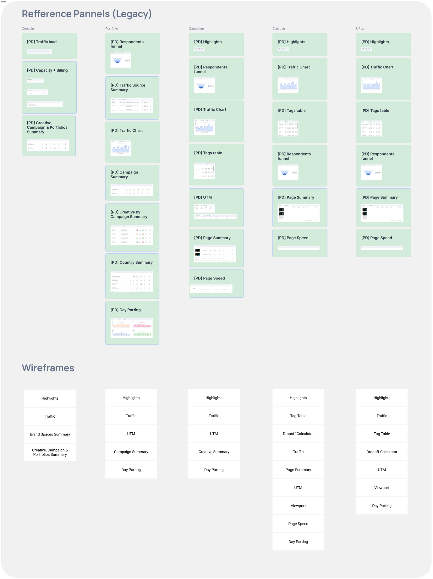
2. Content maping: the metrics shown in the reports that we would keep or remove and the ones that demanded fixes through back-end.
3. Benchmarkings: extensive research on similar projects;
4. Pencil sketches and digital wireframes (low fidelity prototypes)
Conclusions
→ We needed both performance highlights as well as detailed data;
→ Mobile resolution wasn't a priority (based on a massive majority of accesses on desktop);
→ Educational features: every single pannel should be linked to an wiki article to explain about the metrics shown;
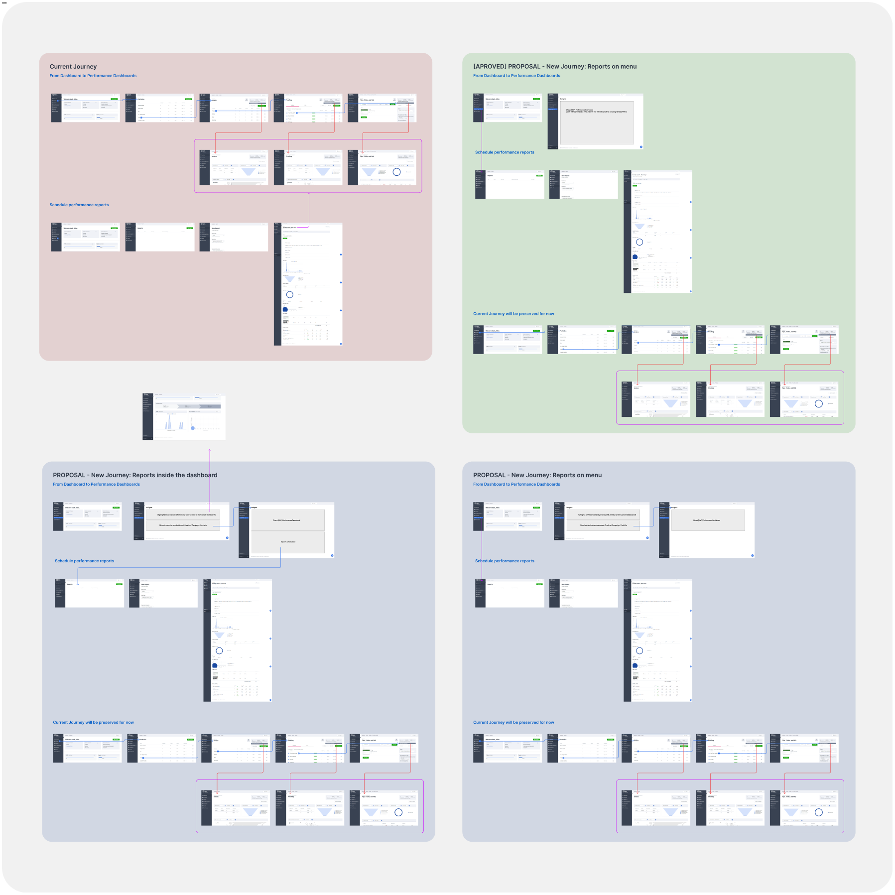
→ Old routes to the reports were kept, for the benefit of old users, and new touchpoints were created, for the benefit of new users.

Prototyping
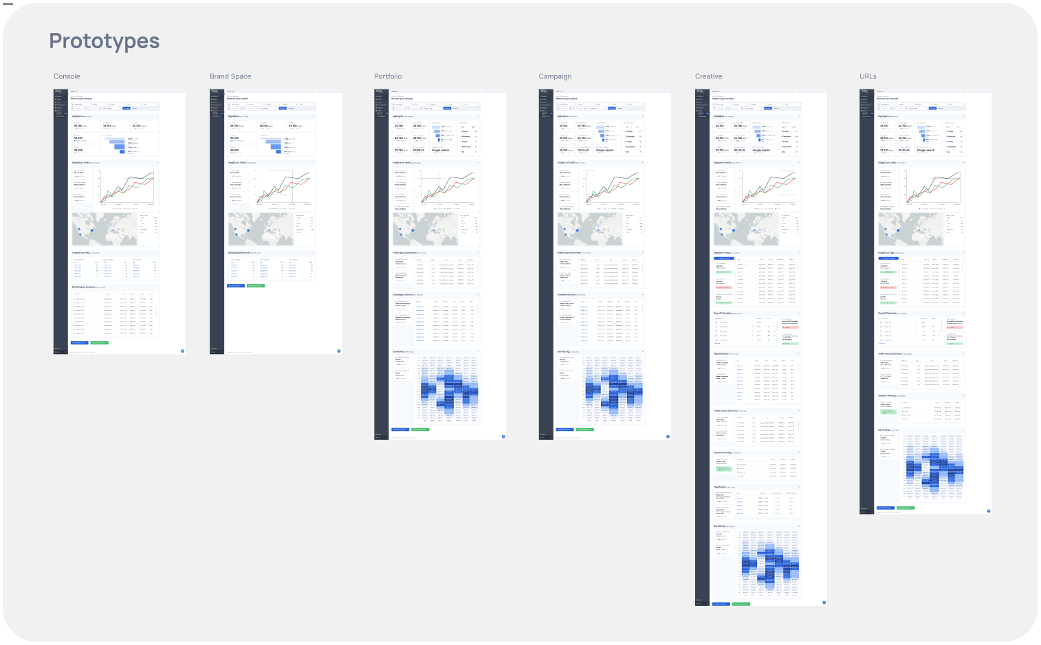
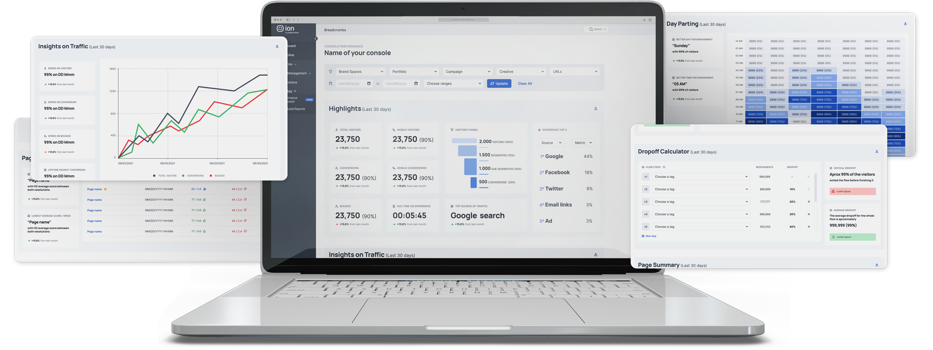
Good news for our users
→ Highlights panel: to synthesize quick information
→ Pro tips: now we're no longer presenting only raw data, but also providing tips of to do with them
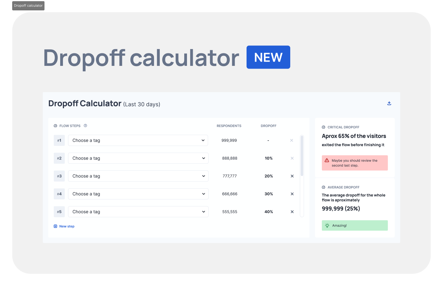
→ 4 new panels: we heard the users, and built new panels offering new metrics vital to 2022 businesses
Though decisions
→ Desktop VS Mobile: as the massive majority of users access exclusively through desktop, mobile wasn't a priority for the MVP
→ Shy application of Design System, due to the amount and complexity of legacy code. Modernizing the UI was a huge challenge!
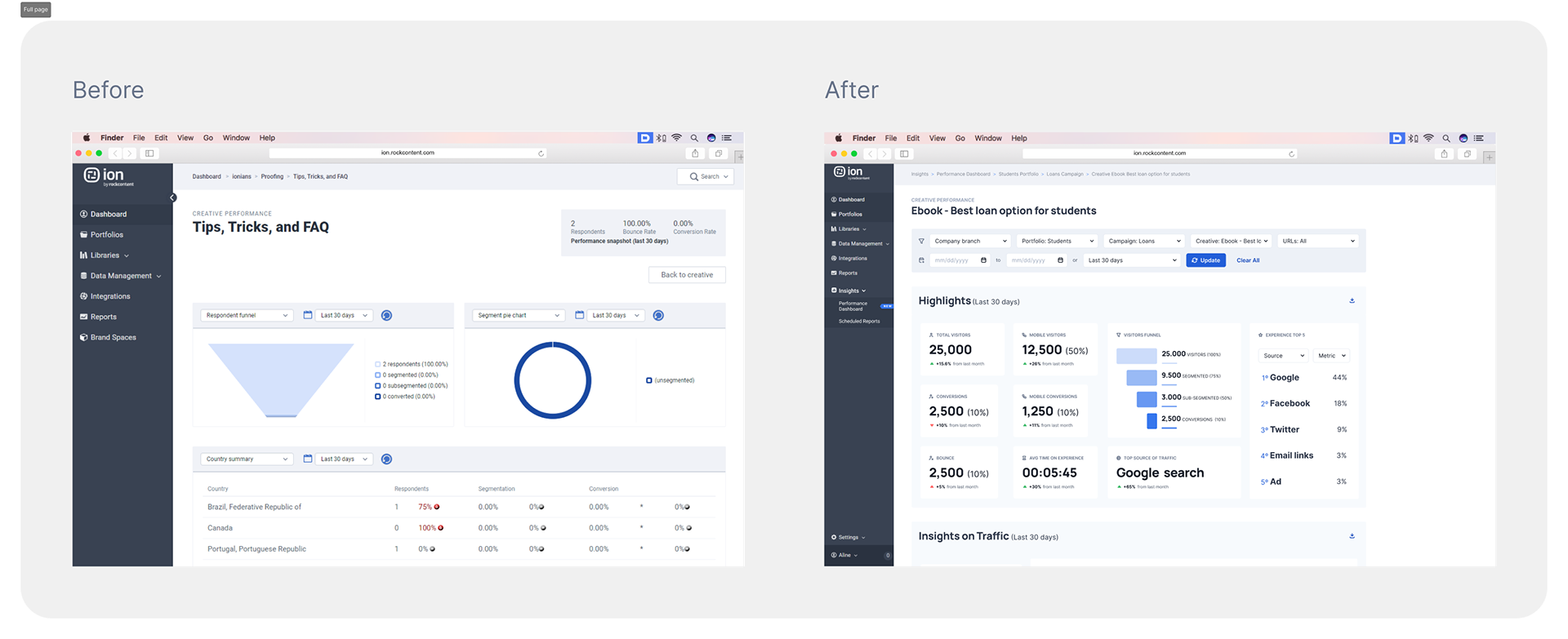
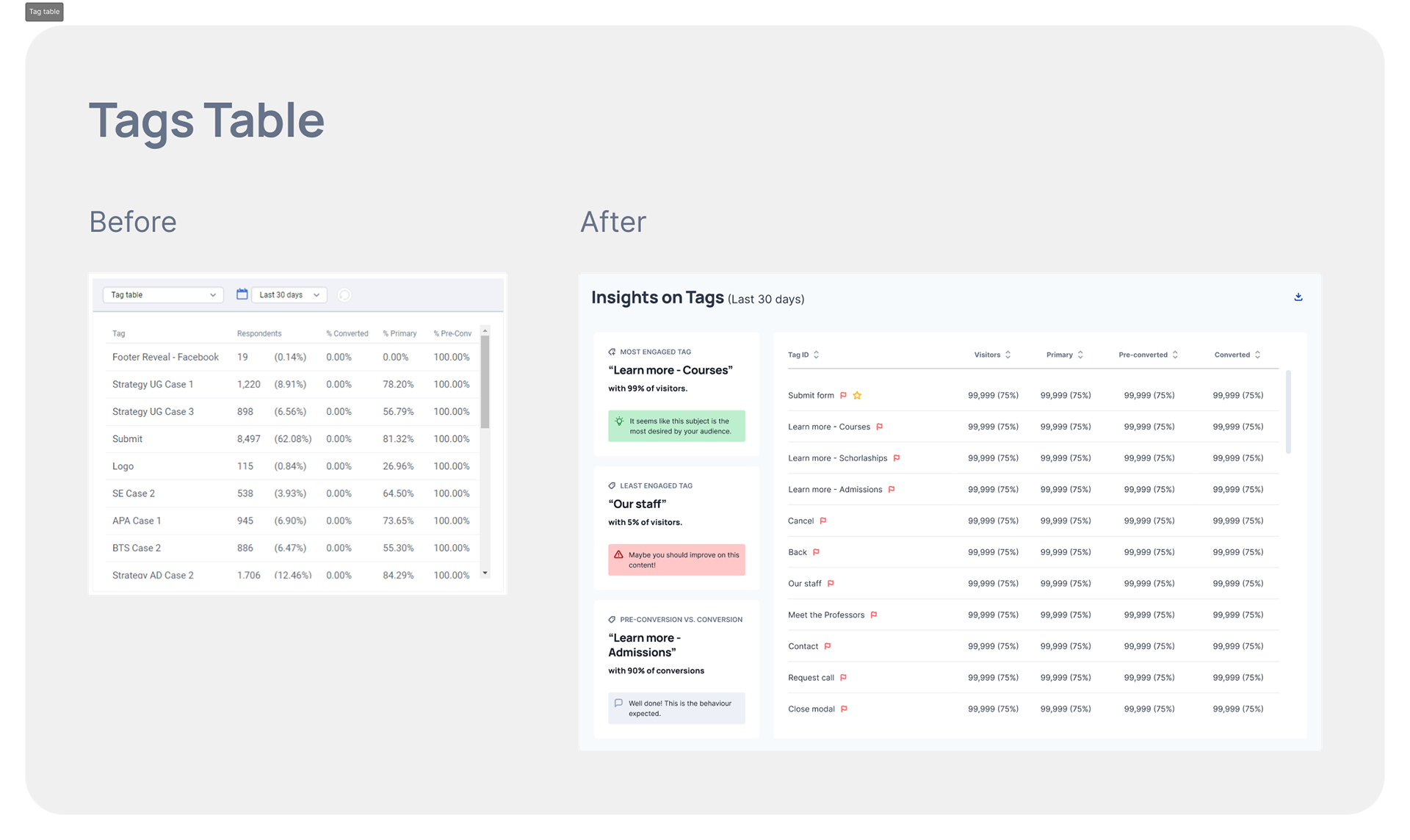
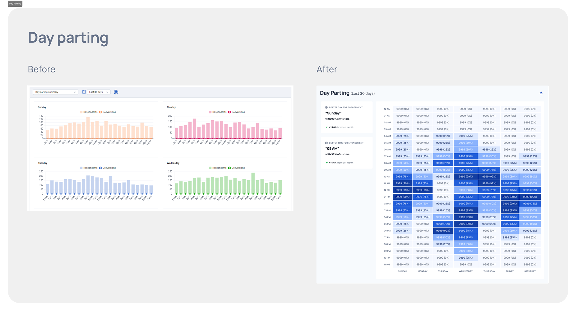
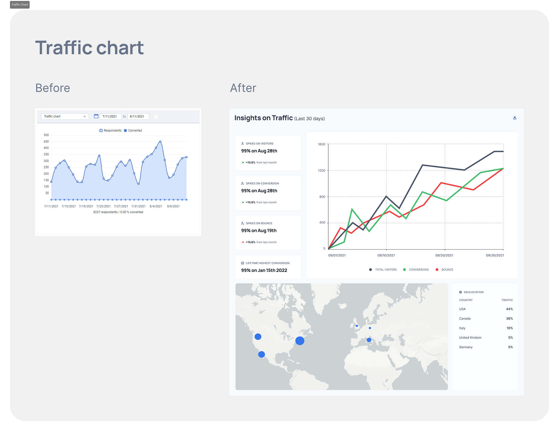
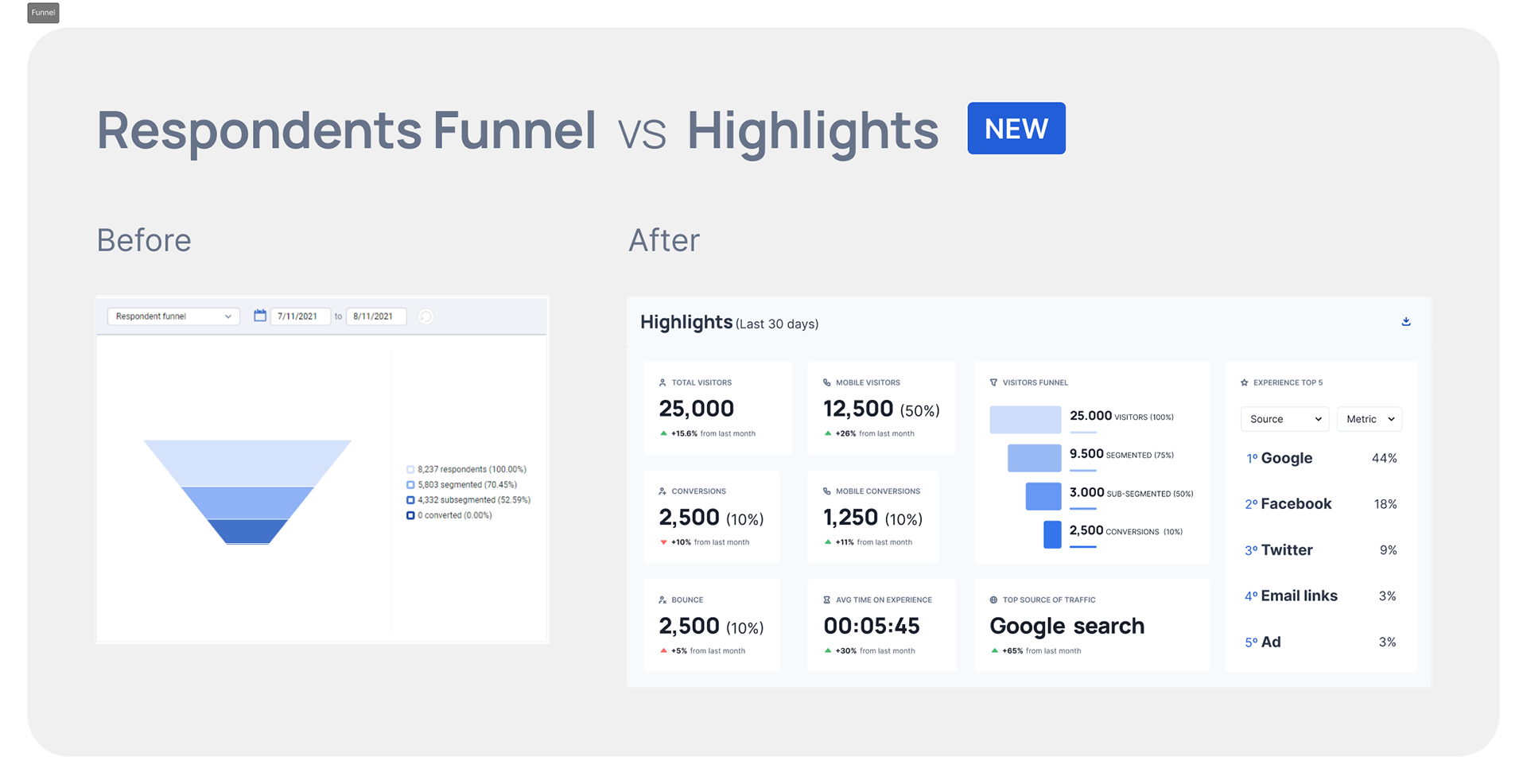
Before and After

Validation
Method
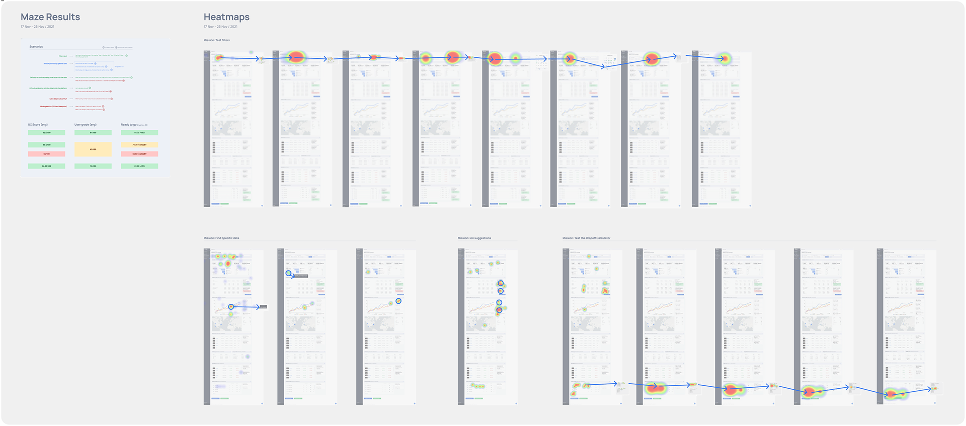
Non-moderated usability test with 5 light users
Tool used
Maze.co
Missions
→ Mission 1: Use filters to open an specific report ▶ UX Score: 82.5/100
→ Mission 2: Find an specific data ▶ UX Score: 80.4/100
→ Mission 3: Find an specific recommendation ▶ UX Score: 50.0/100
→ Mission 4: Calculate a drop-off ▶ UX Score: 86.0/100
Action plan
→ Mission 3 was the most challenging for light users. The mission consisted on asking the user to find a recommendation given by a new panel. We understood this mission was too hard on this group, and decided to move forward but keep tracking struggles.

Handoff and Results
Development phases
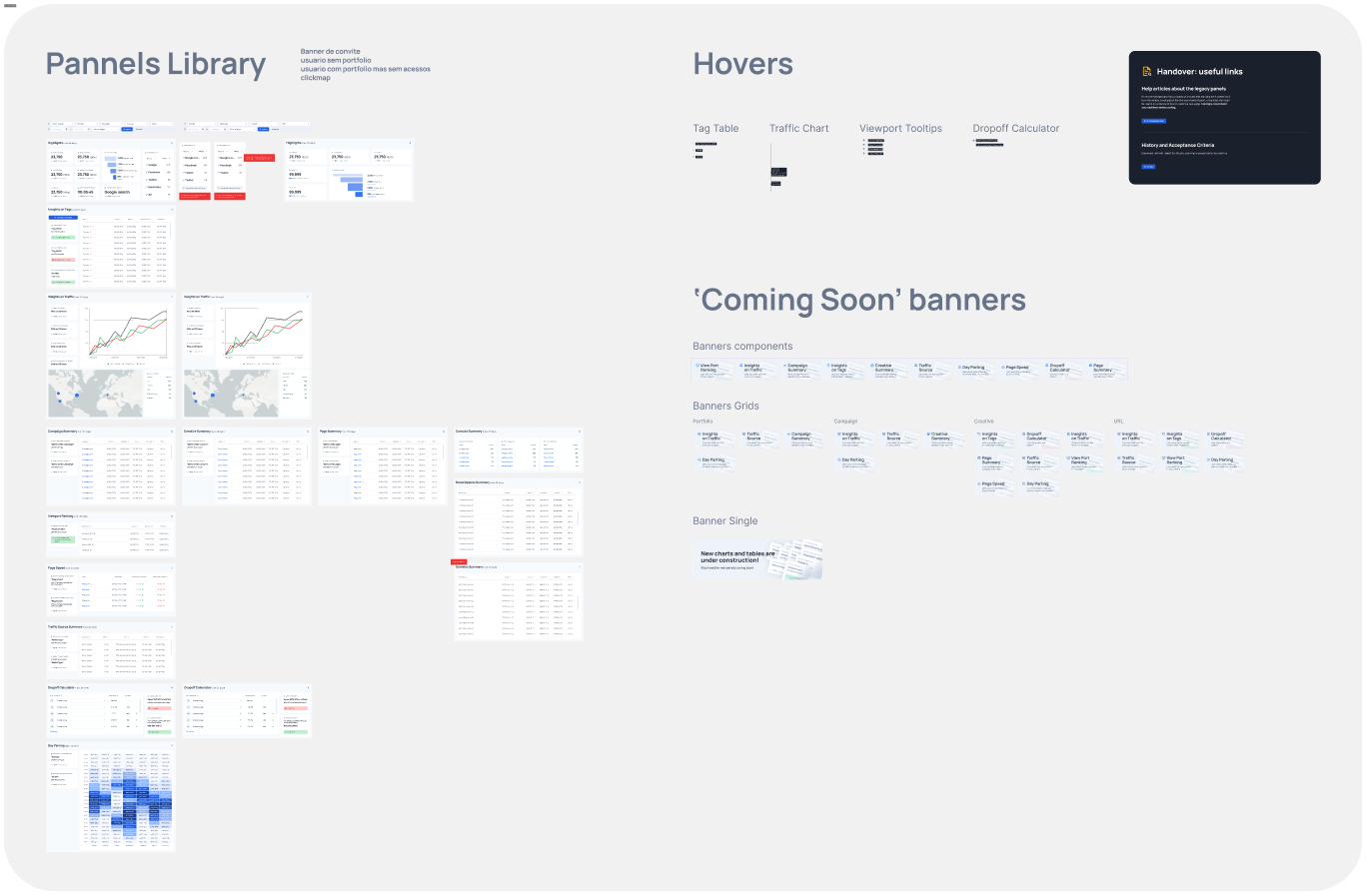
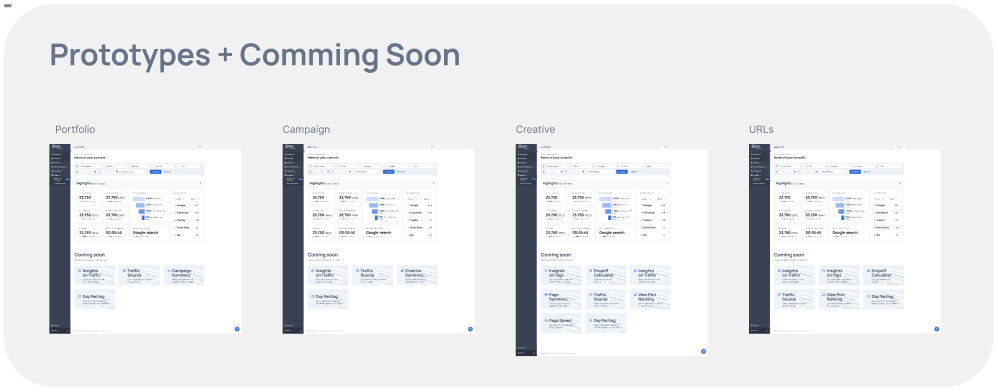
→ As the legacy code was a challenge and needed a lot of back-end, we decided to implement these panels one by one, and used the "Coming Soon" banners to measure engagement. The most engaged panels were the ones prioritized;
→ As the new dashboard took many sprints to be fully deployed, the old dashboard needed to be kept co-existing with the new before we could take it down;
Results
→ The teams SLA to produce and send the report presentation to our customers dropped from 7 to 1 business day (86% in time-saving);
→ CSAT collected for the following 6 months after release: 84/100

Thank you for reading!